There is always a strong and constant need for data visualization tools. Whether a small corporate firm or a big tech company, all future planning is based on data and predictions.
The best way to do this is through data visualization, which combines data presentation and analytics.
Having some open-source data visualization tools at your disposal is always good, as they help present data efficiently. You already know their importance if you are in engineering, data science, or business analysis.
That is why, in this guide, you will find the list of the best open-source data visualization tools that are powerful and reliable.
Best Open Source Data Visualization Tools
1. Charted
Charted is one of the best open-source data visualization tools on the list. Its MIT license makes it reliable.
The popular blogging platform Medium developed this tool and it is now available for all. One of the best things about this tool is its advanced automation.
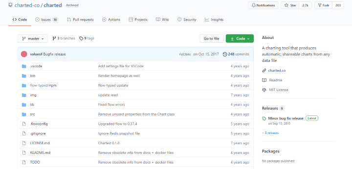 All you have to do is provide a data file link and then the tool runs all of its metrics to provide you with a presentable data set. The platform’s interface is simple and clean, so you won’t face any issues using it.
Also Read- Best Statistics Software and Tools
It supports many file types, including comma-separated values (CSV), tab-separated values (TSV), Dropbox share links, and Google Sheets.
2. Redash
If you are looking for a cloud-based open-source data visualization tool, Redash is a perfect choice. This tool runs on an SQL server and has a seamless online SQL editor.
With this tool, you can create pie charts, bar charts, tables, line graphs, pivots, cohorts, scatter graphs, maps, and other data visualizations by focusing on the core elements.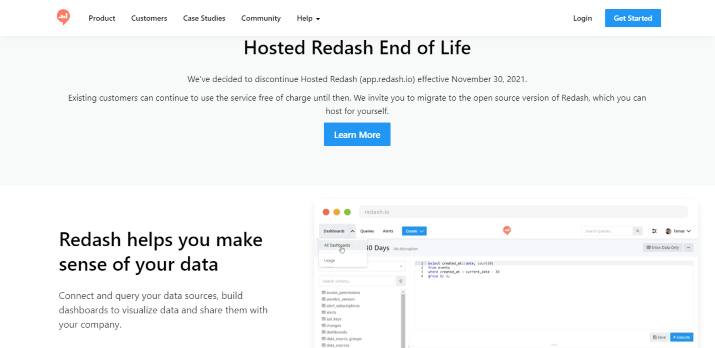
The platform interface is simple and easy to use and the cloud-based nature makes it easily accessible. People with good expertise can even tweak some features due to the platform’s open-source nature.
3. Google Charts
Google has also created its own open-source data visualization tool, Google Charts. With this tool, all you have to do is provide a data set to the tool, giving you some clean and interactive graphs and charts.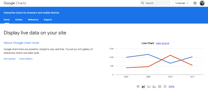
This tool provides a wide range of data visualization options, around 100, ranging from simple bar charts and line graphs to symbol annotation, buckle axis, stacked area, date timeline point, and many others.
You even have the option to customize the data output according to your website’s theme. This is one of the best open-source data visualization tools available.
4. D3.js
Next up on the list is D3.js, also known as D3, a popular JavaScript library for data visualization and analytics. D3 here means Data-Driven Documents. So naturally, D3 focuses on web standards like HTML, SVG, and CSS for data manipulation.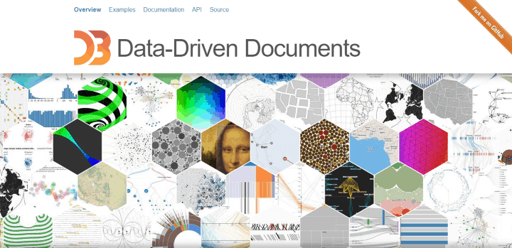
Since it is a JavaScript library, you, as a user, can copy, use, modify, and distribute it in any way you like. All you have to do is acknowledge D3’s copyright.
Also Read- Best Websites to Learn Python Programming
The flexibility you get here is not present on any of the other tools on the list, which is another great feature of this platform. So make sure to try this one out.
5. Grafana Labs
Grafana Labs is a great data visualization and analytics tool. It is distributed under the AGPL 3.0 license, which allows you to access data anywhere easily.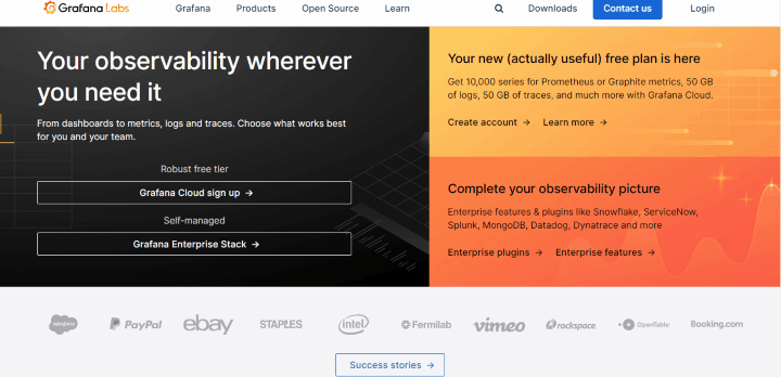
The tool can then be used further for data visualization and sending queries. One of the best features of the tool is its collaboration options, which allow you to create dynamic and reusable dashboards. If you have data from multiple sources, then this is the perfect tool to blend them all.
6. Chart.js
Next up on the list is Chart.js. This data visualization tool is quite similar to Google Charts as it provides clean data output for your website. For example, it can combine bar charts and line graphs in one output unit so you can easily compare the two. 
The tool can also animate your data outputs, making them more interactive. With many customization options, it is seamless to use.
7. Dygraphs
If you want to create some interactive graphs for your audience, then Dygraphs is easily one of the best open-source data visualization tools. The tool can easily handle a huge set of data. 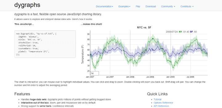
One of the best things about the tool is that it offers many customization options for users. The tool is compatible with PCs, mobile devices, and tablets, so it can be used anywhere.
8. RapidMiner
RapidMiner is not an ordinary data visualization tool. Instead, it is a suite of software programs on the cloud. This will be the perfect tool for you if you want a data analytics solution.
The seamless tool has a great interface and powerful automation to make things easy for you. This tool accepts many data types, including text, graphics, multimedia, etc. Make sure to try it.
 in 2024")
")
")