As a part of Google’s push in making Android apps suitable for large screen devices, YouTube Music gets a revamped Settings page.
The new Settings page is condensed to clean up all the settings into groups and has its sub-settings shown in a side column, similar to the Chrome browser on the desktop. This better makes use of huge space available in large screen devices like tablets and foldables.
Revamped Settings For YouTube Music App
At this year’s I/O event, Google announced tuning over 20 of its first-party apps to better suit the tablets and foldables – where users are facing difficulties in handling basic functions of apps. In this pursuit, we saw Google working on a split keyboard for Gboard, and now on YouTube Music.
A new update to the YouTube Music app on Android makes the settings section a lot cleaner now, which in large screen devices is seen better. Shared screenshots show that the Settings page is divided into two columns, where all the condensed settings are on the left, and the sub-settings of each of them are on right.
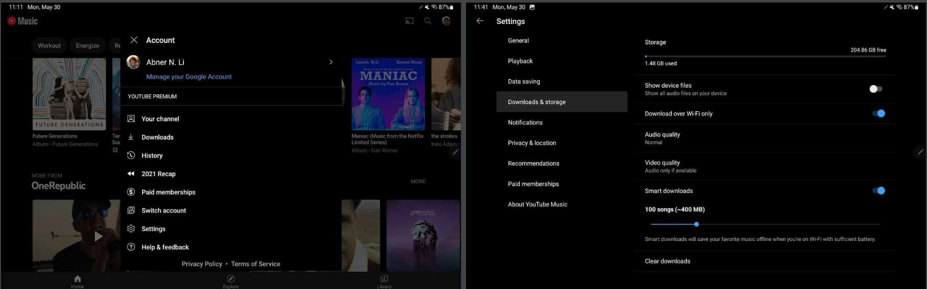
This may seem similar to the Chrome browser’s settings page in the desktop, where you can two-column division for a better checkup. This is obvious since large screen devices have a huge space to play around. Also, grouping up settings like this makes the UI look better, and less cluttered up.
This new settings page is purposefully available for Android tablets and Chromebooks, and may not come to general phone versions. Although, we expect Google to make a condensed view of current settings in the phone app too.
YouTube Music app for phones has also received a new playlist UI earlier this month – which moved the album art to the center, with the names and playback controls showing up right beneath it.
")

